sideby
Brand identity
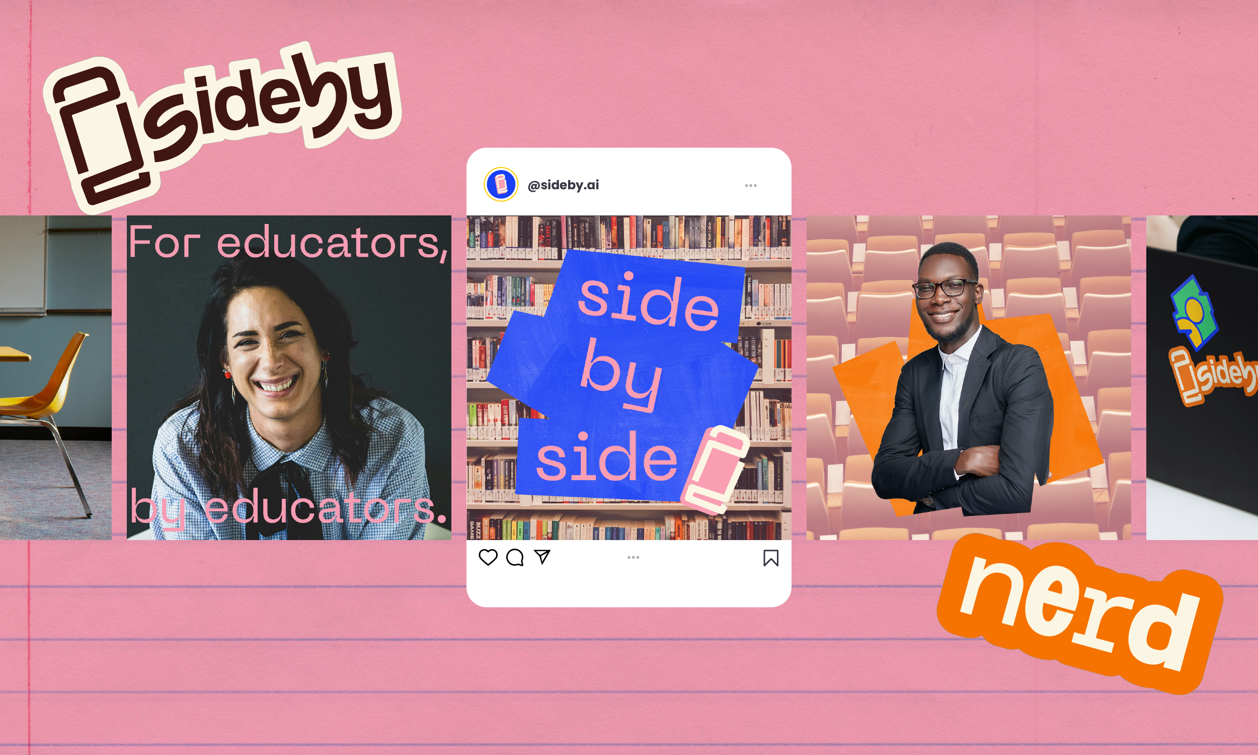
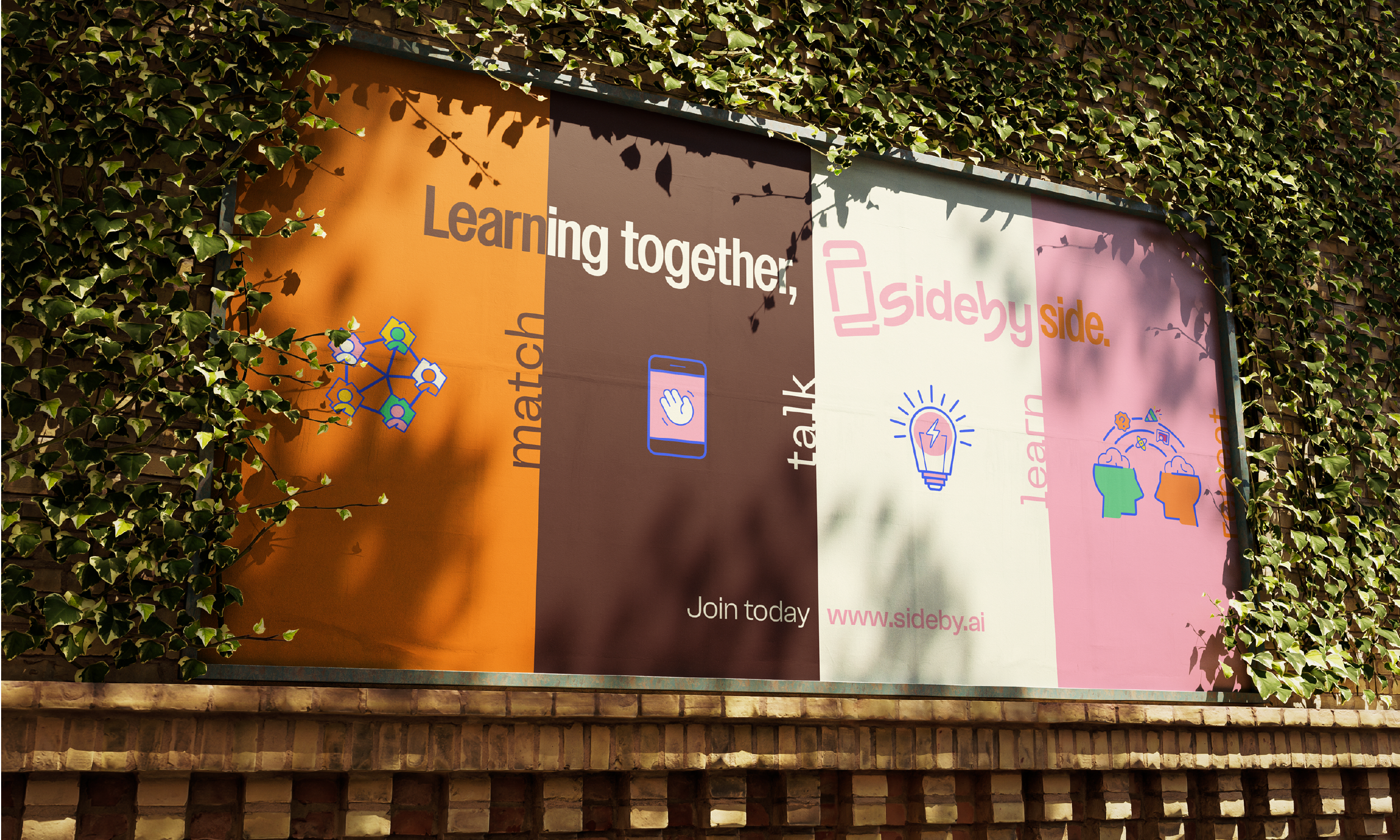
sideby is a free learning community where K-12 educators connect in one-on-one, guided conversations to explore how AI fits into their everyday work. They’re bringing AI-powered, peer-led learning to the people shaping the future of education: educators.
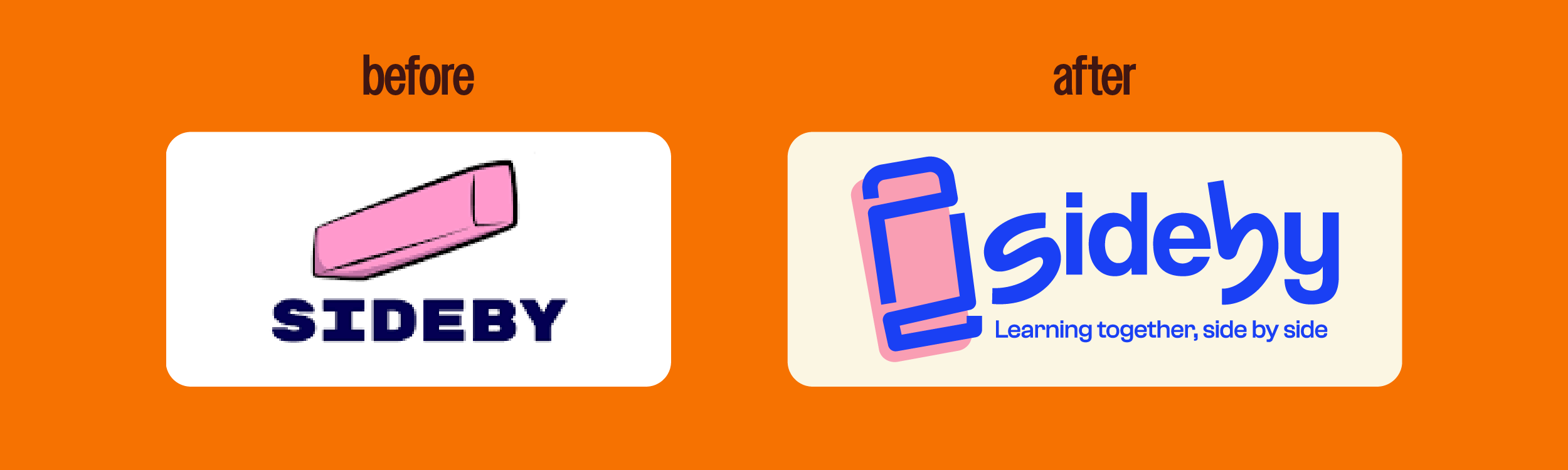
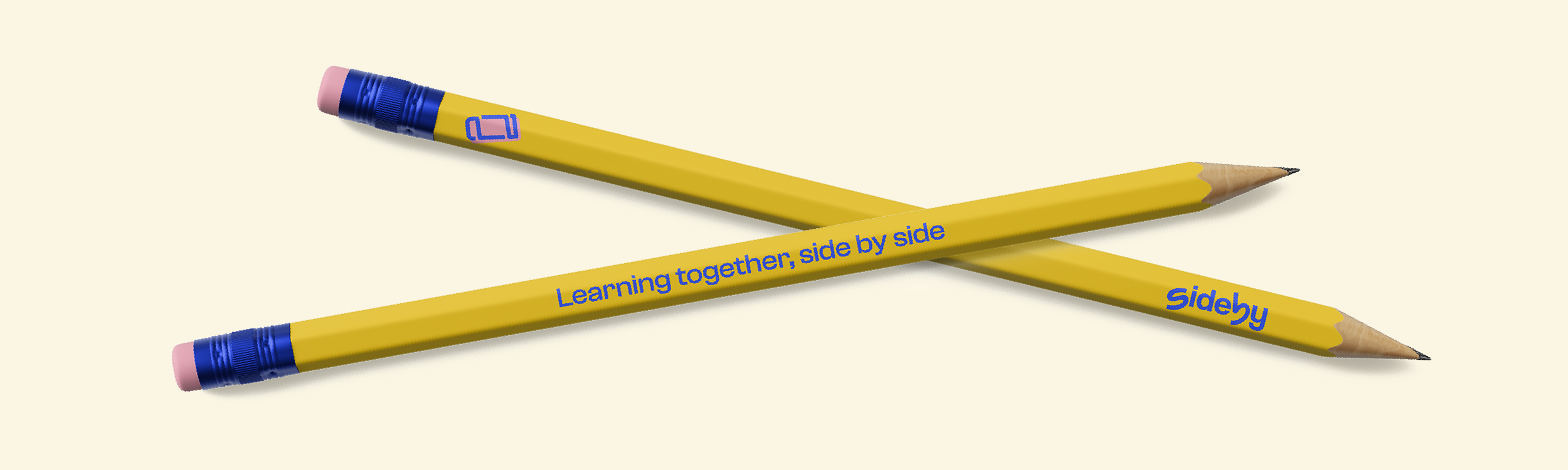
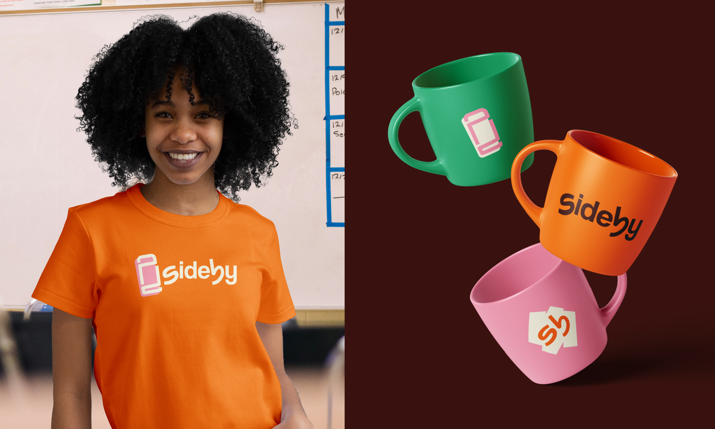
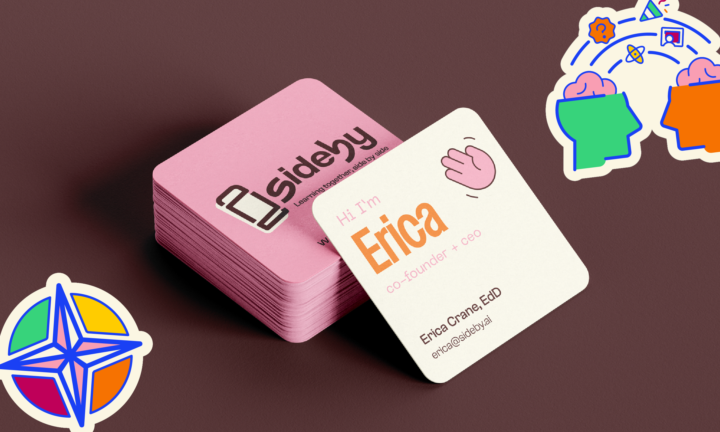
The brand started with the iconic pink eraser: a symbol of learning, making mistakes, and trying again. We wanted to feature classic school elements but balance that with sideby’s tech-forward approach to build a balanced visual system that stands out in the space while still being true to the organization’s values. Eraser scribble shapes, techy typography and iconography, and a brand mark that’s emblematic of an eraser bring an energy that’s forward looking and having fun with the process.
Made in collaboration with Studio Junk
Creative Direction: Anjuli Garcia
Design: Tay Smith Studio
Website Design: Claudia Teng
Website Development: Standard Operations
Brand Animations: Kameron Davis
Ready to stop patching and starting planting?
I’d love to hear what you’re working toward and how I can help.