matchbox
Brand strategy
Visual identity
print design
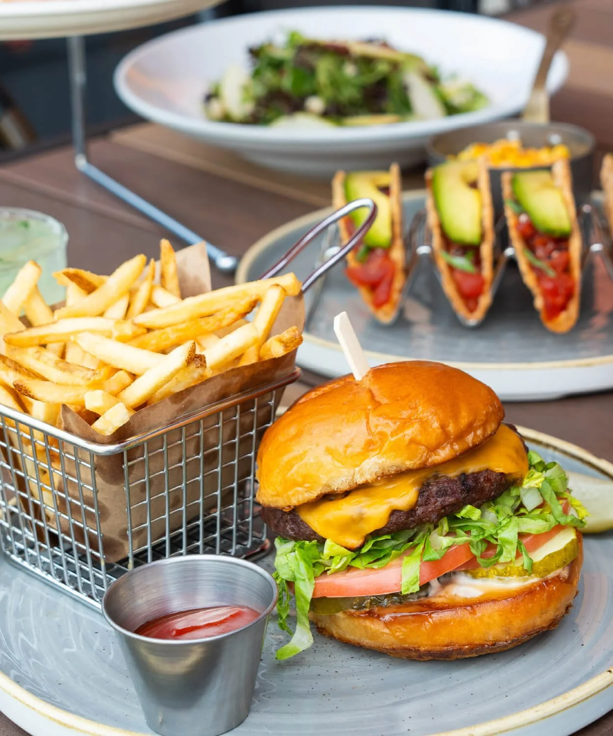
A chef-driven, made-from-scratch concept from Thompson Restaurants, matchbox is best known for iconic wood-fired pizzas, mini burgers, and unforgettable dining experiences. And after over 20 years serving the DMV and beyond, the brand was ready for a refresh. Customers were looking for more—so we got to work transforming the brand into something customers were excited to revisit.
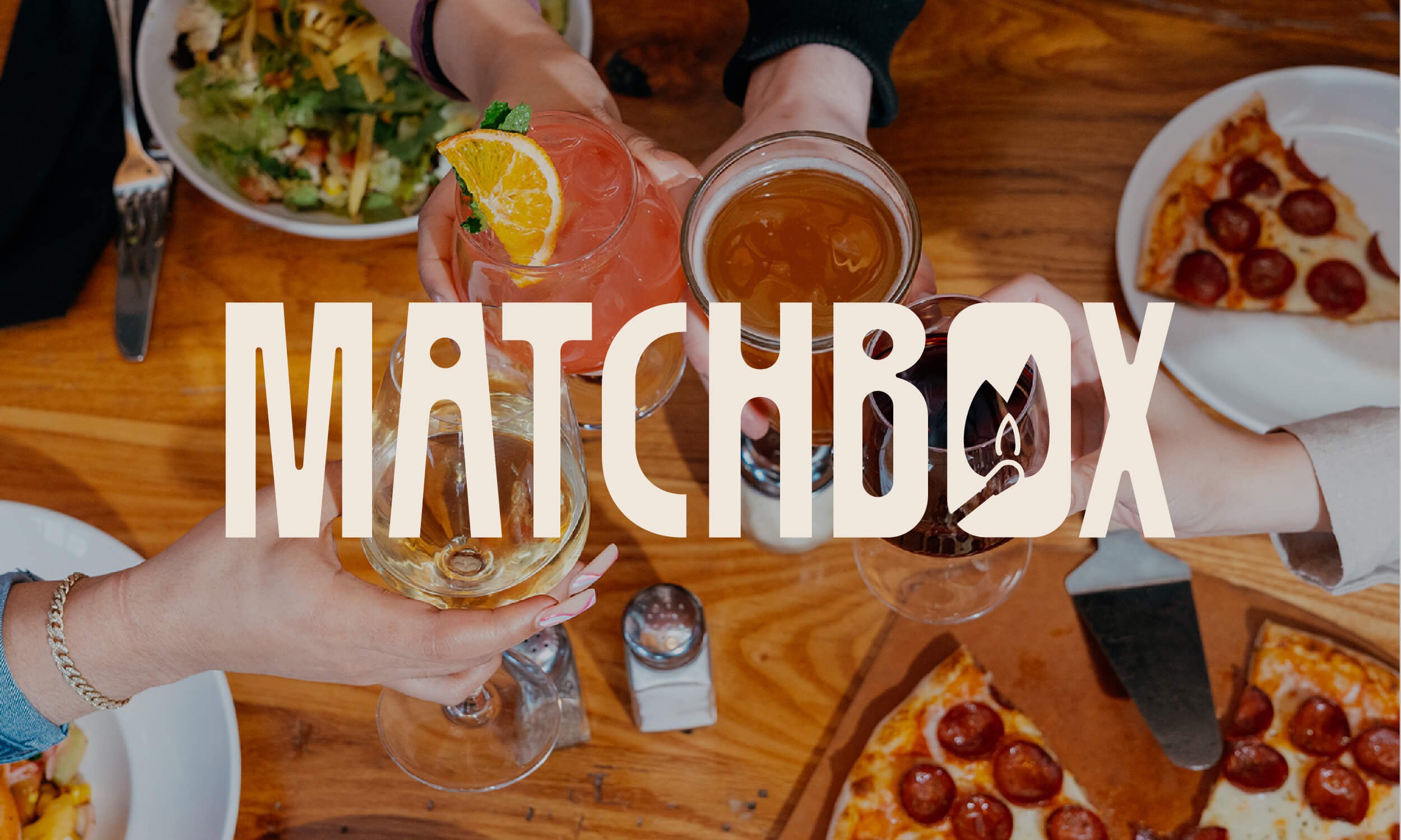
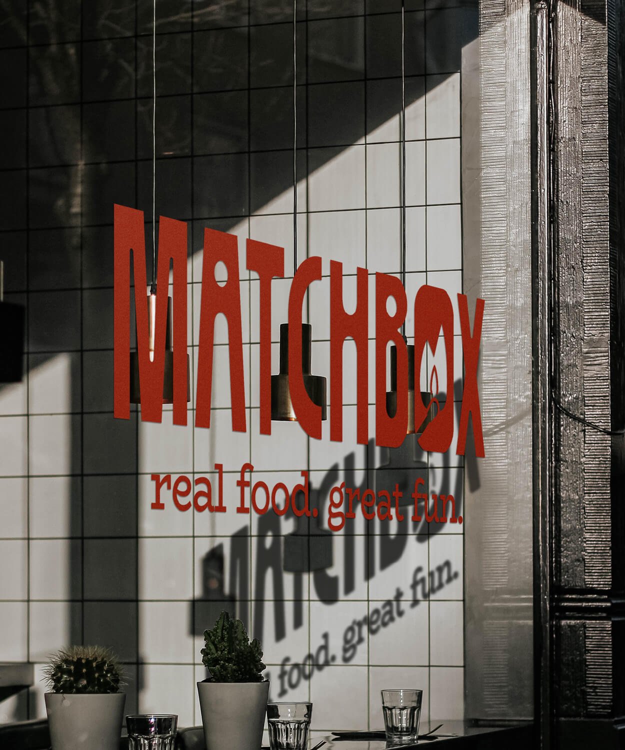
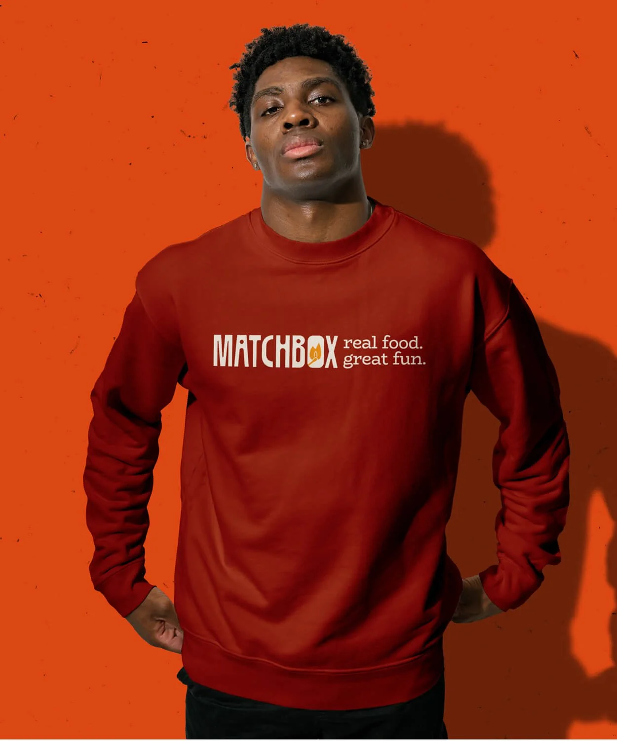
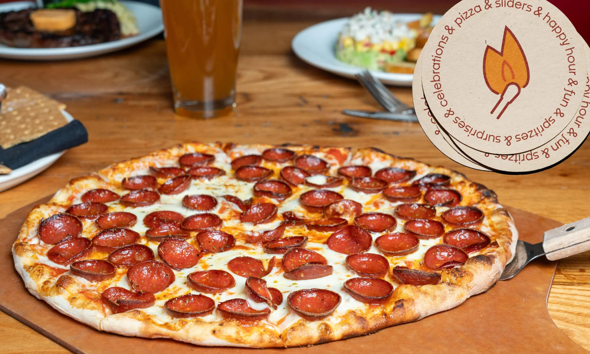
Grounded in the brand’s iconic red, we took an artful approach to add energy and flexibility. The new wordmark was streamlined to incorporate the match for flexibility in executions, and the expanded color palette and bauhaus-inspired illustrated elements and patterns extended the brand’s visual language. Along with a unique but accessible typography suite, the new identity breathes new life into every execution from the website to menus to social media.

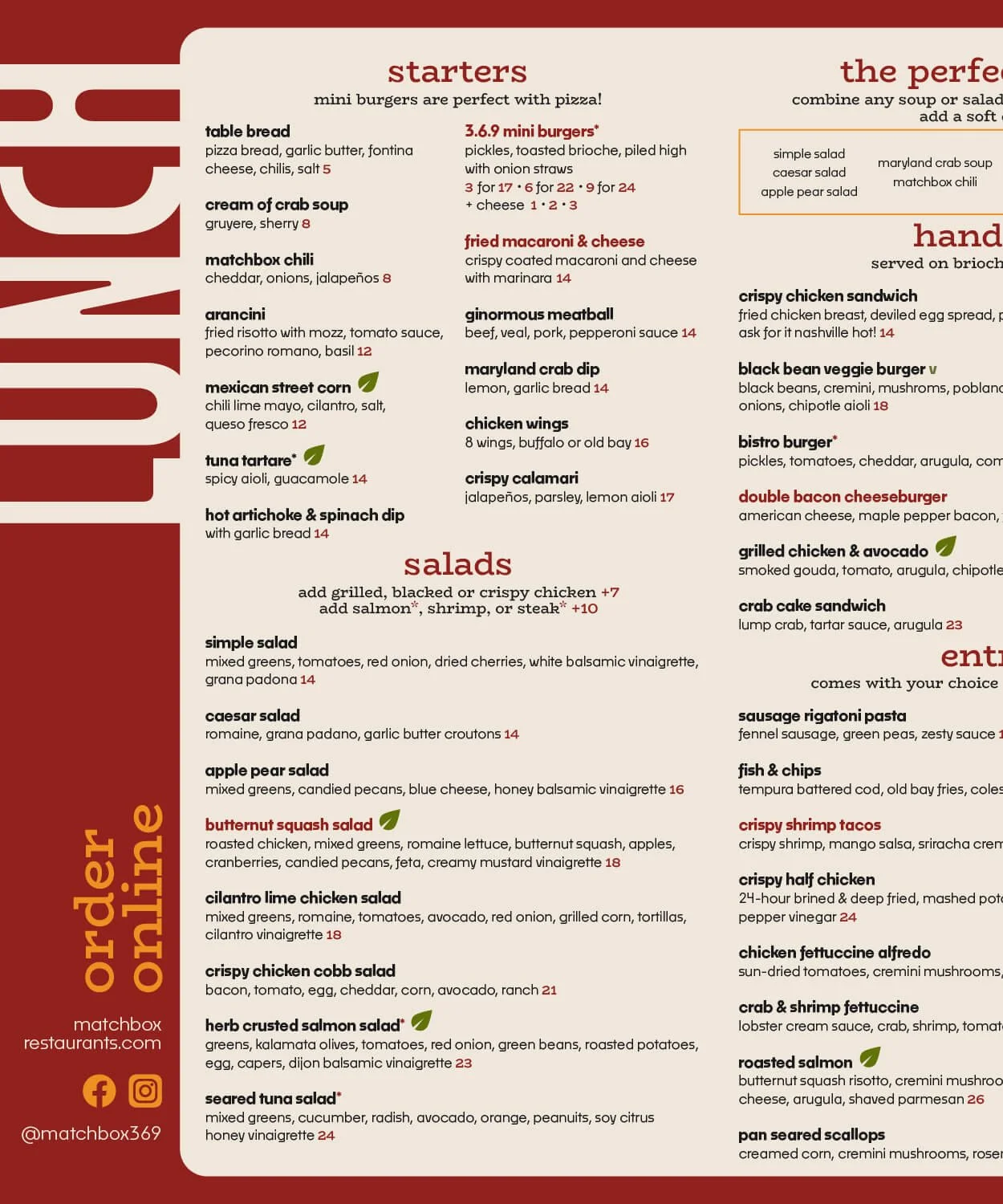

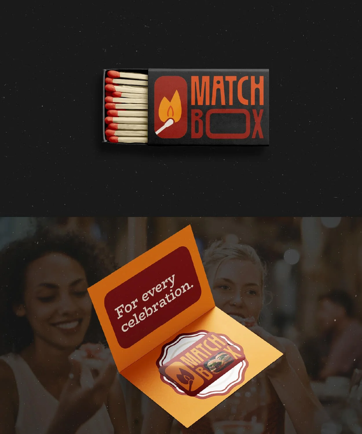
The team at Thompson has everything they need to show their customers that they heard their feedback: a revitalized brand identity that brings the spark into the future of this legacy brand, a flexible set of systems (logo, typography, art direction, and more) that make it easy for the team to do everything from update a social post to opening a new location, and comprehensive guidelines to serve as a north star as the brand continues to grow.
Matchbox is where real food meets great fun.
Brand Strategy, Visual identity, print design, & motion graphics:
Tay Smith Studio
Food Photography:
Thompson Restaurants
Unsplash

“From all of us, THANK YOU.
It has been a true pleasure working with you to bring this brand to life! You are great at what you do and we appreciate your patience, hard work, and the time you spent on creating this brand.”
CAROL PASQUARIELLO | VP MARKETING, THOMPSON RESTAURANTS
Ready to stop patching and starting planting?
I’d love to hear what you’re working toward and how I can help.